If you own a page that sells something, there is a small space between making a sell and losing a potential customer. It’s called “call to action”. It is estimated that 90 percent of people who look at your website will read your CTAs. That’s why, creating a convincing copy for this short sentence or button is probably the hardest part of copywriting process. However, if well-written, can bring a lot of benefits. I’ll explain you why you should focus more on your call to actions and how to create a perfect one.

- Be precise
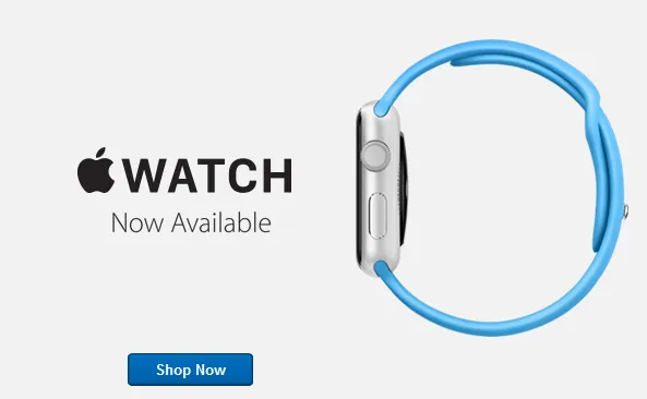
Your call to action is the part of the advertisement, which tells your target group precisely what they should do after seeing the ad. The more information in as few words as possible, the better. Sounds easy, right? One of the things you need to have in mind while writing CTA is to make it clear what your customer has to do. The best option is to communicate it in a clear and precise way, like, let’s say, “Buy now”. Apple uses words that are short and easy to understand. Short paragraphs, short sentences and simple words (unless they are presenting a technical explanation). The most important things are shown, not told.
2. Be unique
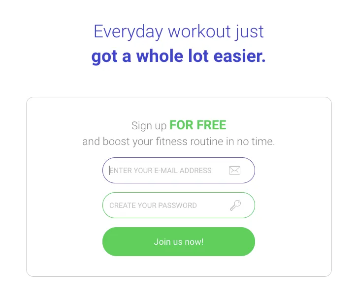
As precise as CTA has to be, you want it stand out from the claims of other competitors. Focus on your unique selling point and use it! Find something that will give your customers a reason to take the action and create a desire to solve their problem. Try not to make it complicated, but rather easy to understand. FriendBuy company increased its signups by 34% by adding anxiety-reducing content and explaining key benefits next to their CTA. For example, in Performante, we did a well performing campaign for fitness app called “Fitnest” and explained all core benefits of the app right at the beginning of the landing page:
3. Be simple
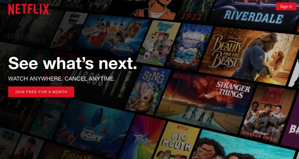
Don’t go overboard with the text volume — use just as many words as needed. Try to add an exclamation mark in the end of the sentence. Use numbers if possible: pricing, discounts, promotions for instance: “50% discount” is much better than “big discount”. If you want customers to call you, provide them with your number. If your are offering something, which is free — mention that. Everybody loves free stuff. That is why Netflix uses persuasive text to guide you to their free trial (also, you can notice here that the red colour of the CTA on the button matches Netflix’s logo colour).
4. Be persuasive
The right call to action can persuade your customers to do many things: buy a product, download an app or trial, read the whole article or share something on their social media. If you use a strong, command verb and action words, you are more likely to gain more conversions. So encourage them to “read more” and “reserve a spot”, whenever you need. Colours also matter. Using different colours for calls to action or buttons than for the rest of the website has proved to show conversion improvements.

5. Be urgent
When customers see your call to action, they need to know what a great opportunity they will miss by not clicking on it. Your call to action aims to create urgency, a need of doing something now, with no option of delay. Customers have to be convinced that the clock is ticking and with every second, a chance of getting something great is floating away.
Whether it’s a button or a small sentence, your call to action is a thing that will drive people’s attention to your product. Which Calls to Action appeal the most to you as a potential customer? Don’t wait any longer, let me know and get 100% more conversion improvements! ;)